Vendée globe - Exploratory data analysis
While looking at Vendée Globe data, I had the feeling of some patterns to explain why are some skippers laggards and why some others are always in the top positions. I wondered what kind of graph could be used to help confirming or disproving such feeling.
Here are the conditions to meet
- 33 sailors at start, and this is decreasing as the race goes on
- sailor gender has to be considered as for now, a woman has yet never won this race
- having a boat with foils might bring an advantage. This has to be considered
- current race position has to be considered by group as shown on previous post distance to finish
- graph should be created for speed, distance and velocity made good speed to the goal
- data have to be extracted from Vendée Globe daily vacations see official ranking and prepared to get per sailor/boat five nums series min, q25, average, q75, max
- data series could be incomplete due to abandon
I ended up with following results
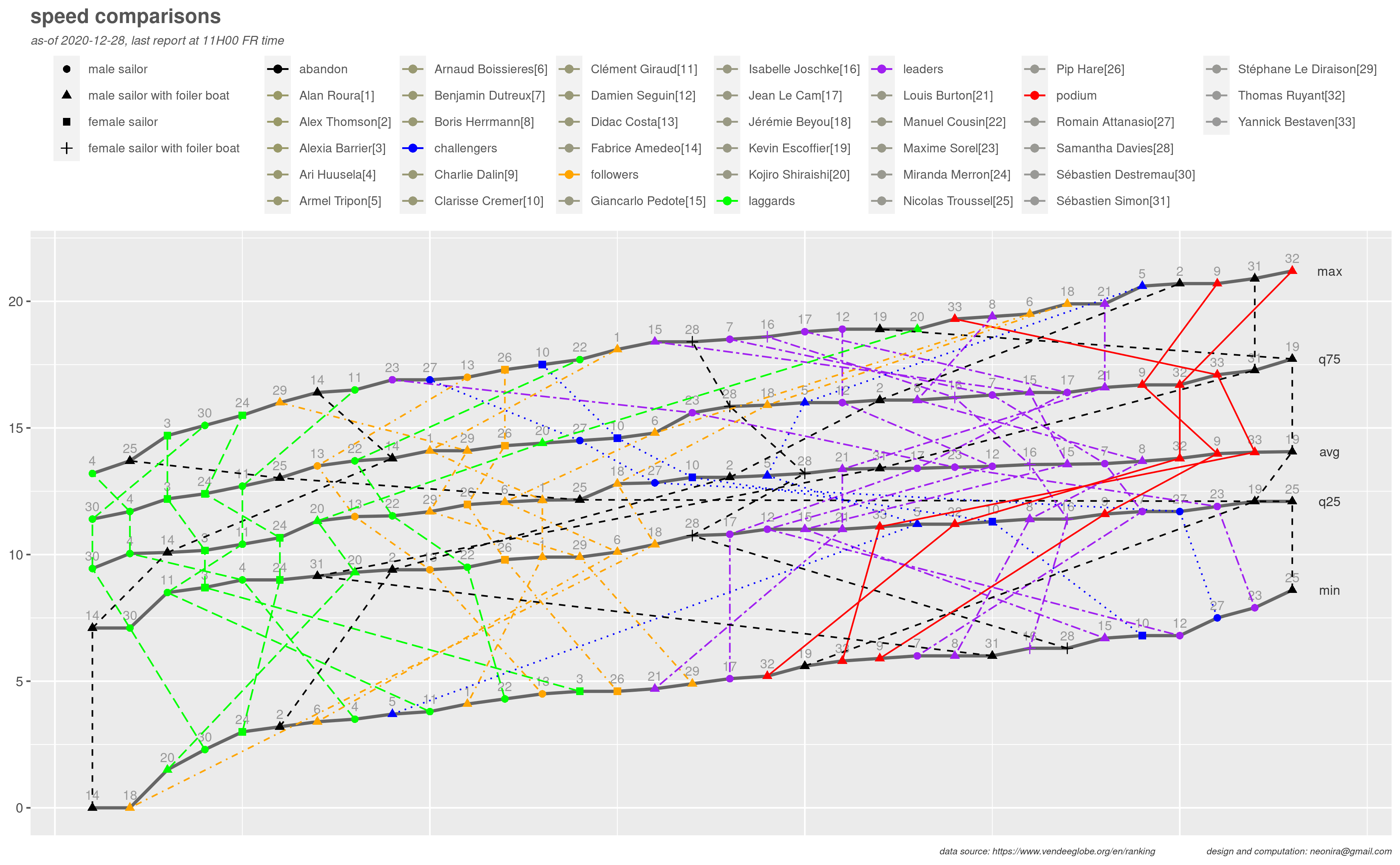
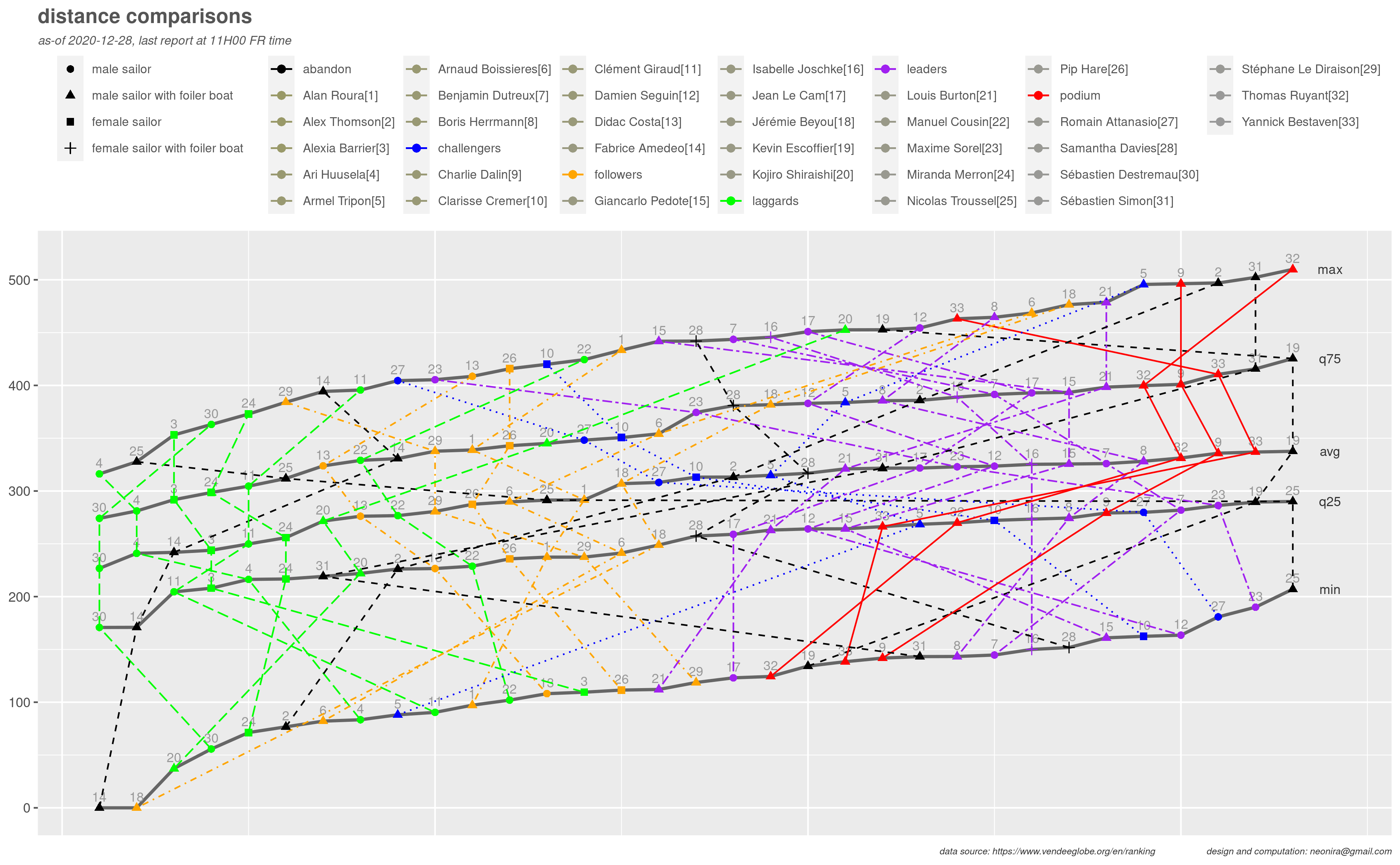
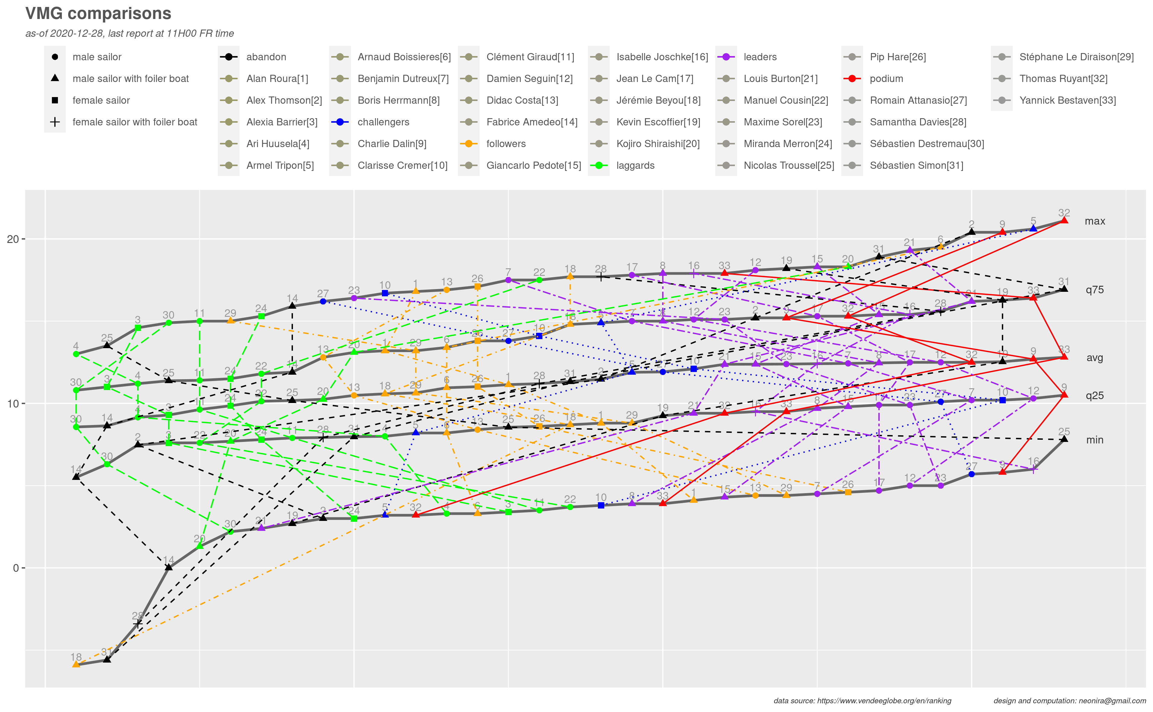
Creating such diagrams is more complex than it appears at first glance. It requires much more data wrangling than expected, and many diagram color manipulations that are rather awkward and unintuitive.
Indeed, I am not fully satisfied of the result as I would have got a separated color legend for sailors and race position groups. I did not succeed in finding a way to do so, although there might be a way. Let me know if you have one. Still wondering why there is no way to tell explicitly ggplot2 the name of the legend to consider. This would be simpler and more convenient!
Some remarkable insights can be taken from those diagrams, and should be crossed verified with a stronger machine learning analysis
- Look at the right of the diagrams and consider black triangles. They state that Kevin and Nicolas were soliciting a lot their boat. Both of them had to abandon, Kevin faced very perilous conditions as its boat was simply broken in two pieces.
- Podium sailors apparently know well when to slow to take care of their boat and make the necessary repairs as shown on the min curve on distance and speed diagrams. They also exploit their boat smartly. I mean they go fast, upper to the average but not trying to push to the limits. Again, look at red group shot on the right of the diagrams from avg and q75 curves.
- The vmg diagram shows quite well how color clustering in relationship with race position makes sense.
- The speed diagrams explains the difference between leaders and laggards. Current podium and leader sailors own mainly recently built boats less than 5 year old, with or without foils. Only two notable exception for Isabelle and Clarisse performing very well and with finesse on older boats, the former with foils. On the opposite, most of the laggards own old boats more than 10 years old and many of them have no foils. Moreover, laggards sailors are also mostly newbies on the race 5 on 6 .
Image d’entête, prise depuis le navire de Louis BURTON - probablement sous copyright Vendée Globe.