Vendée globe - comparing skipper race progress
21 Dec 2020
I was asked to answer questions about how to show skipper’s Vendée Globe race progress, especially when comparing far apart skippers.
Vendée Globe official data provide distance to finish, distance to leader and last 24 hours distance traveled. As they are 6 vacations per day, a little bit of data wrangling is necessary to catch up just the right data.
I was wondering what kind of graph should be used to get an appealing and demonstrating result.
I ended up created a compound graph made of a polar bar graph and two polar lines, one for the mean difference and one for the cumulated gap.
To make it easy for anyone, here are some explanations to ease reading.
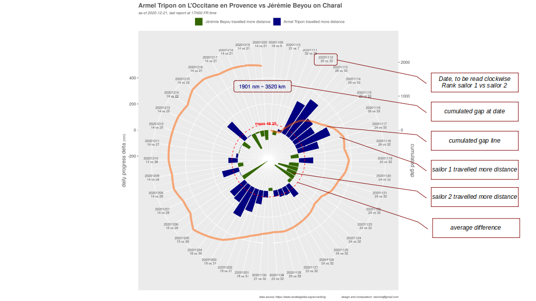
Finally, I produced many graphs to compare various situations. Here are some
The leader versus the coolest sailor
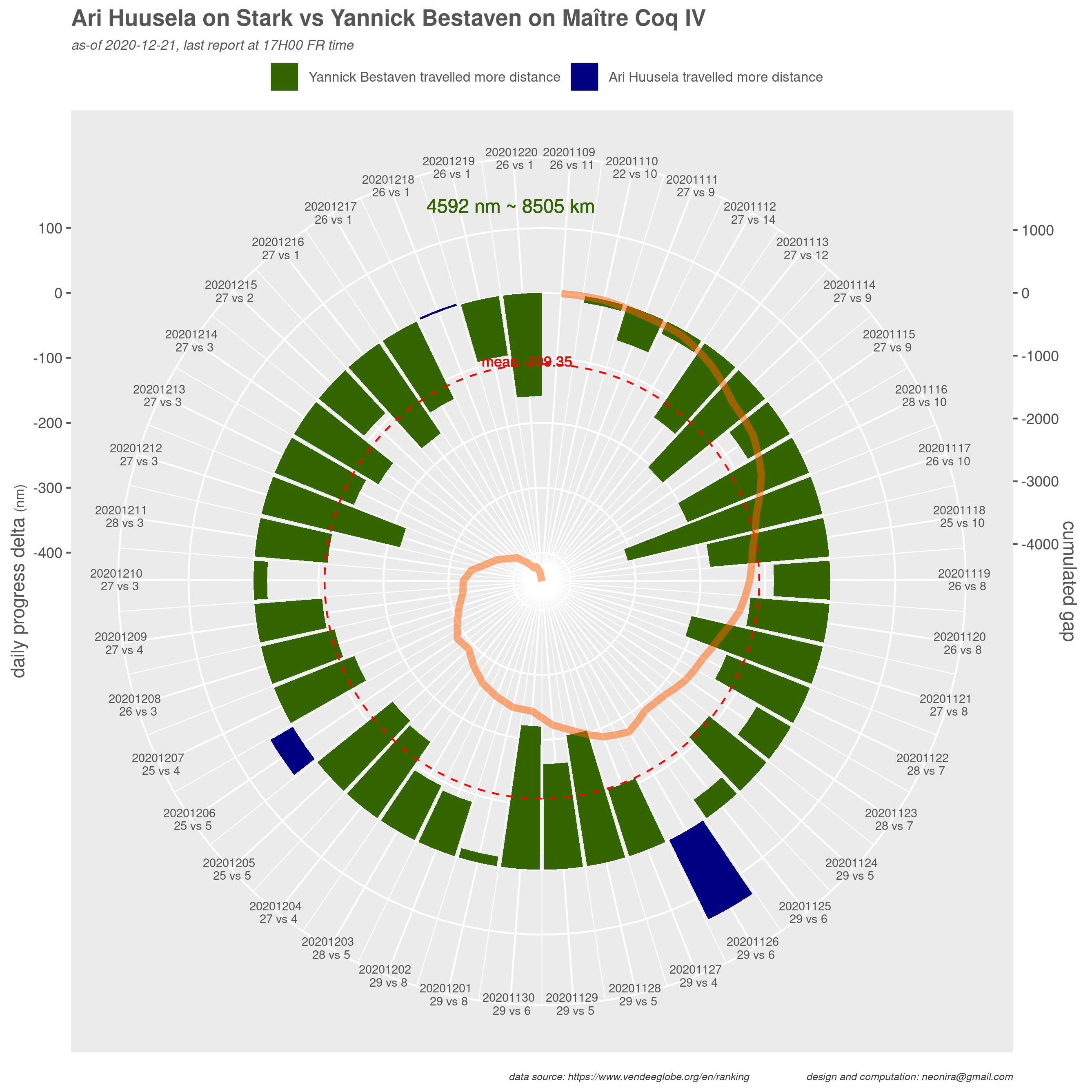
Very great laggard, the coolest sailor Ari is indeed doing well on an old boat. Nothing comparable with current leader for sure, but Ari is gaining experience and the race is still very long to finish.
The great fight between Charlie and Thomas
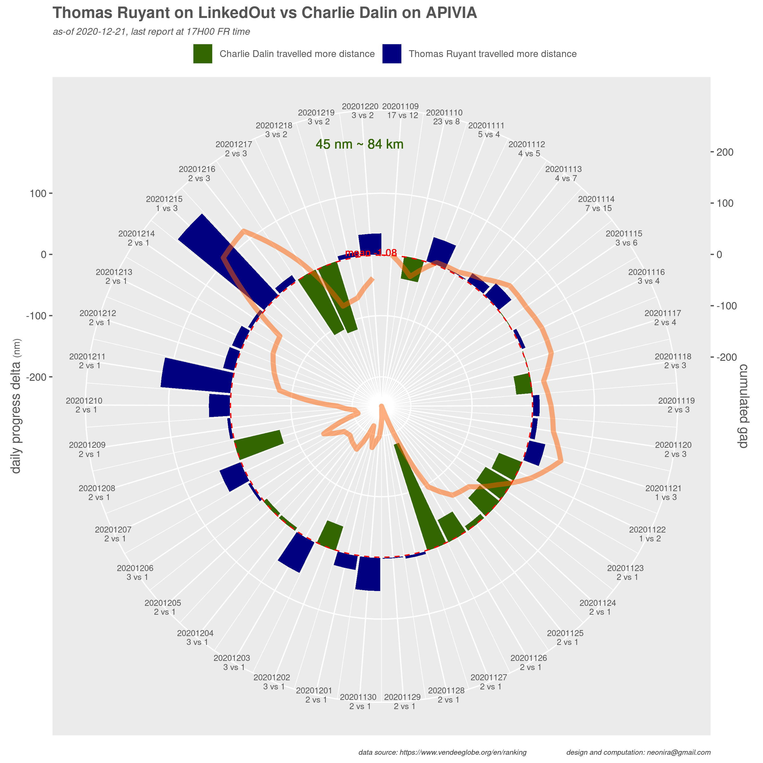
How near this two are is simply amazing after more than 40 days of race!
Leading women
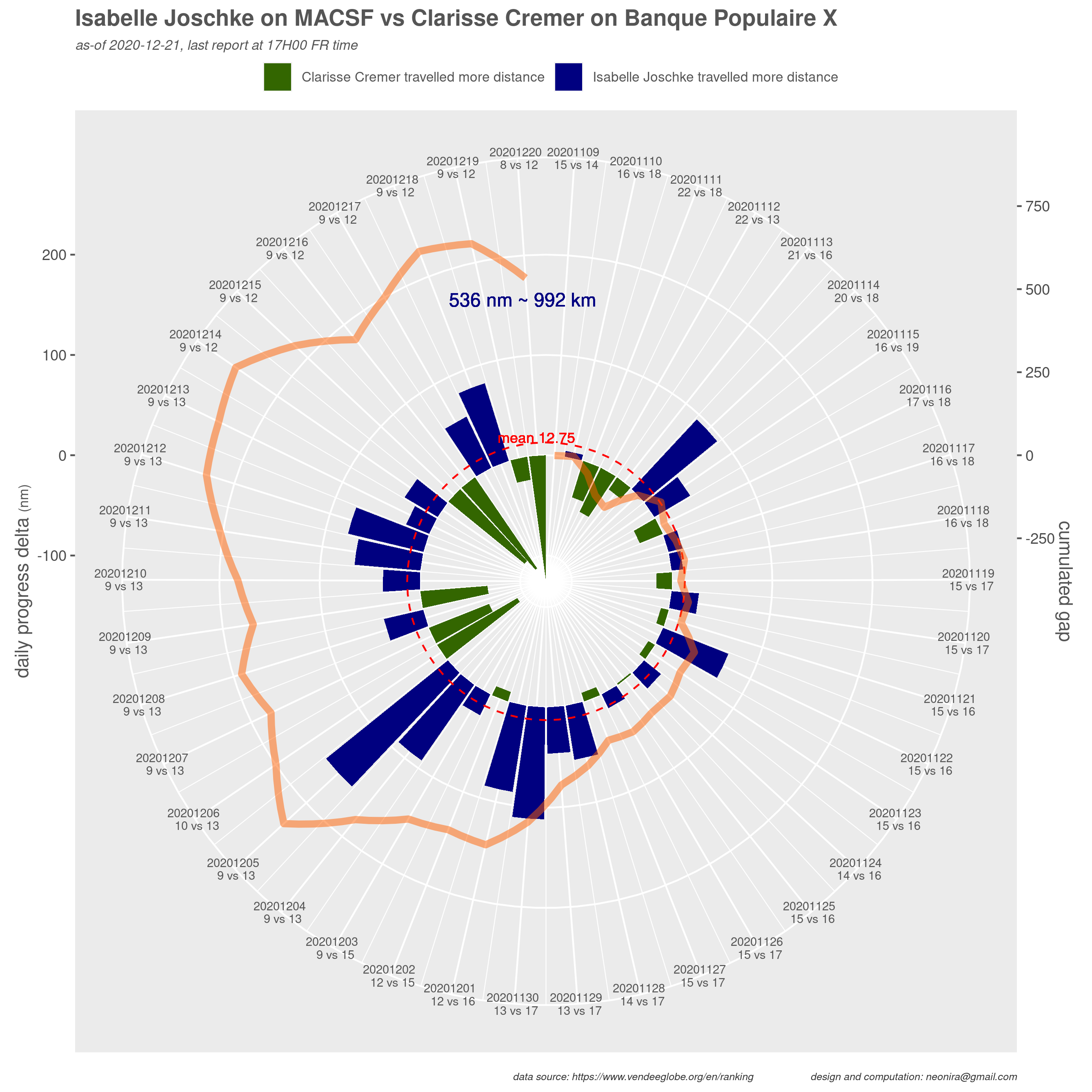
Clearly, a good advantage to Isabelle, but nothing is played, as the current gap can be fulfilled in a little bit more than one good day of navigation.
Will Jérèmie catch up the preceeding group ?
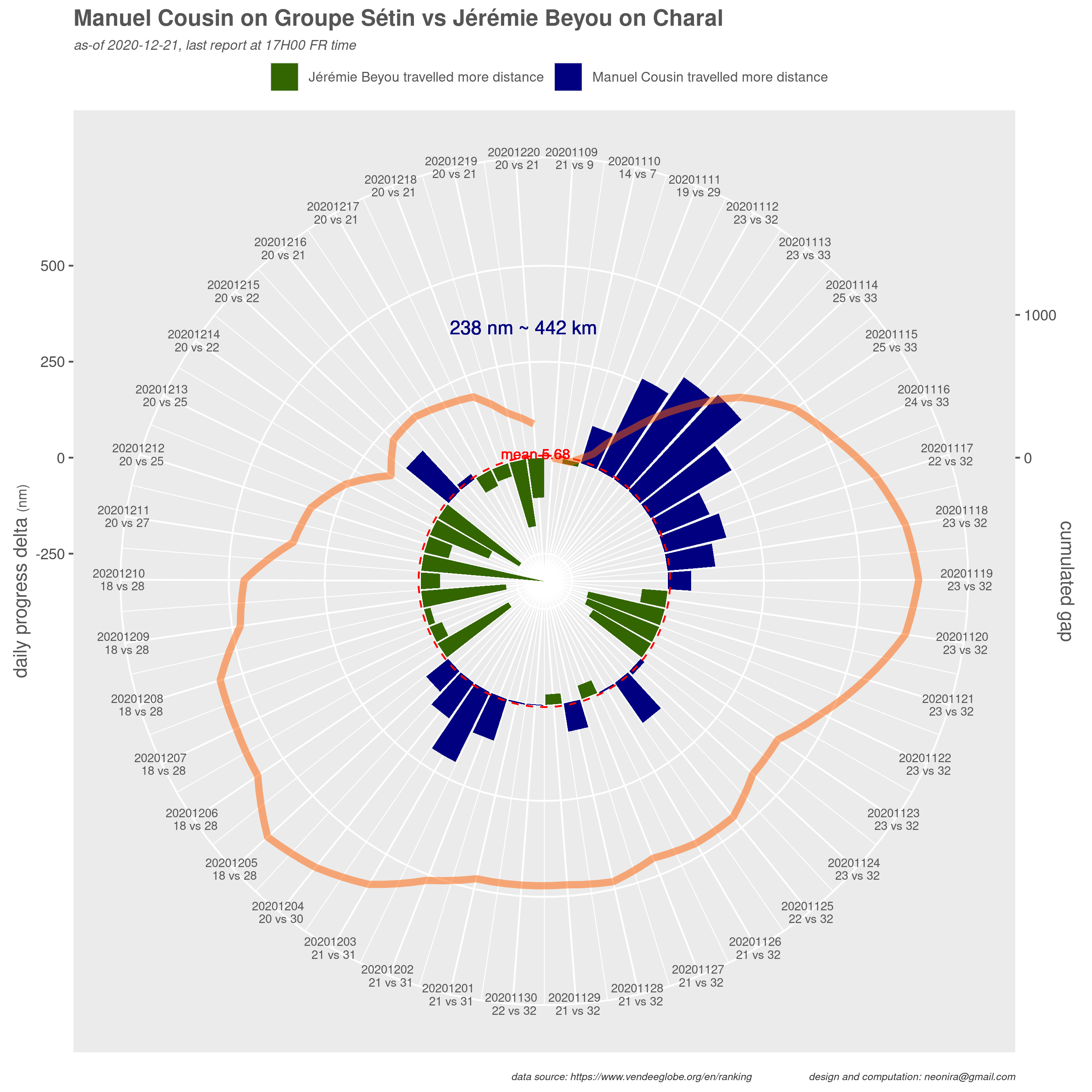
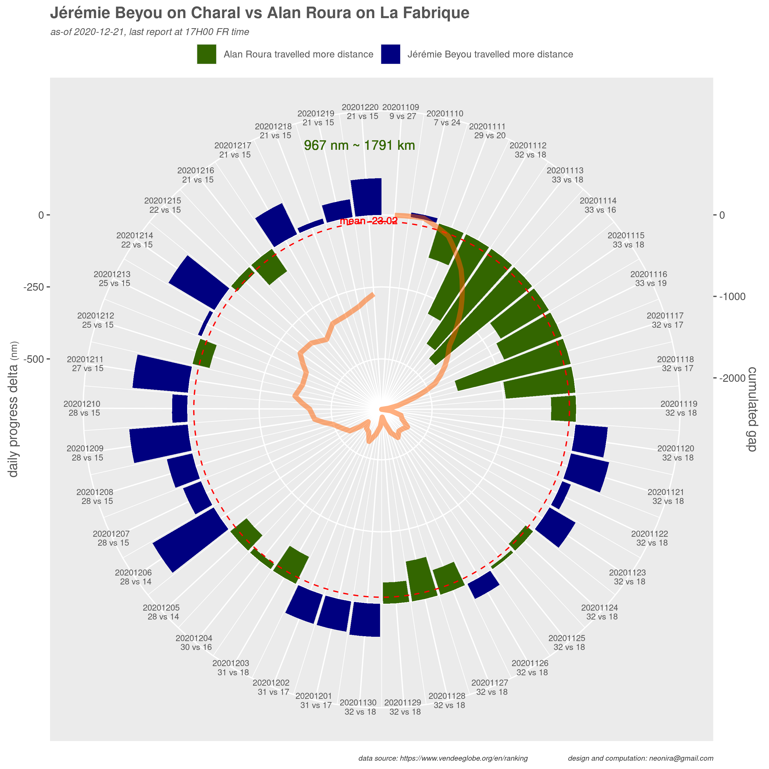
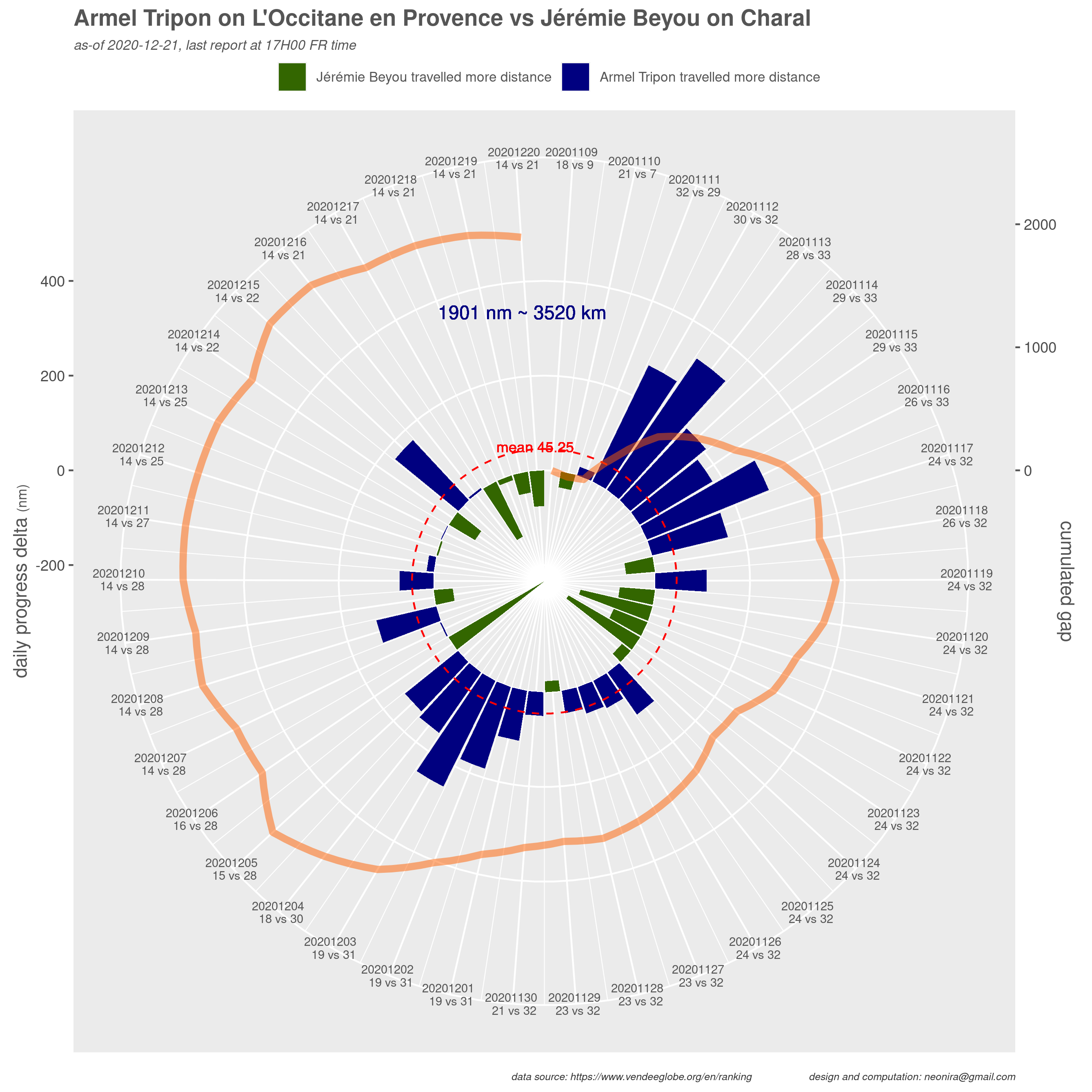
Jérèmie will probably catch up with Manuel whatever the weather conditions.
It could also get back on Alan, but this requires him to get favorable weather conditions. Apparently, a high pressure window is opened in front of Alan, and this would favor Jérèmie to get back on Alan, but this will be a very long run.
To catch up Armel is something much more difficult. Although Jérèmie is a strong competitor, I cannot see how it could come back on Armel, unless Armel encounters heavy boat damage or a race incident. Of course, he could come nearer to Armel, but overcoming him seems nearly unreachable.