Vendée globe - diagrams
Vendée globe started on November the 8th this year, and as provides 6 data vacations per day, to let you create your own diagrams. Here are some, all based on official data provided by the official site.
I was willing to get a little bit more interesting diagrams and stats than the one officially provided. Miss me are
- a diagram showing rank evolution by skipper
- a diagram showing distance to finish by skipper
- a diagram showing daily traveled distance
- a diagram showing daily boat speed
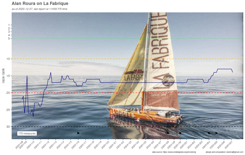
Rank evolution diagram
Rank evolution results from abandons and skipper race strategy. Here under a such diagram. Black flags are set on days where abandons happened. One black flag whatever the number of abandon this day.
This diagram is much trickier to produce than it seems. I did not succeed to produced it using scale_y_reverse, so I had to compute it.
![]()
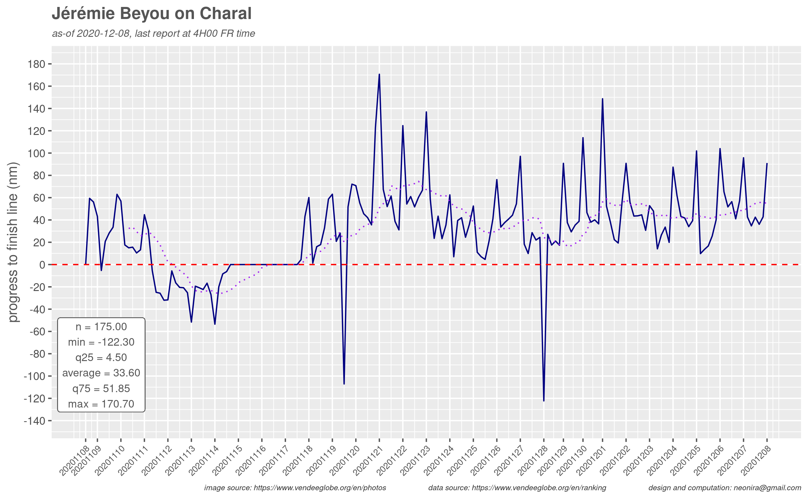
Distance to finish diagram
Here a graph showing distance to finish for skipper Jérémie BEYOU, currently last in the race, due to OFNI encounter. The skipper had to go back to les Sables d’Olonne to repair the boat and then take again the race with one full week late.
In purple, is the moving average computed using zoo package rollmean function. Here, technically aligned at right, with a 12 values spans, as this corresponds to 2 full days of race.
The main lesson is that sometimes the skippers prefer to sail away from the direct route in particular when too little wind, even if it means straying from the goal.
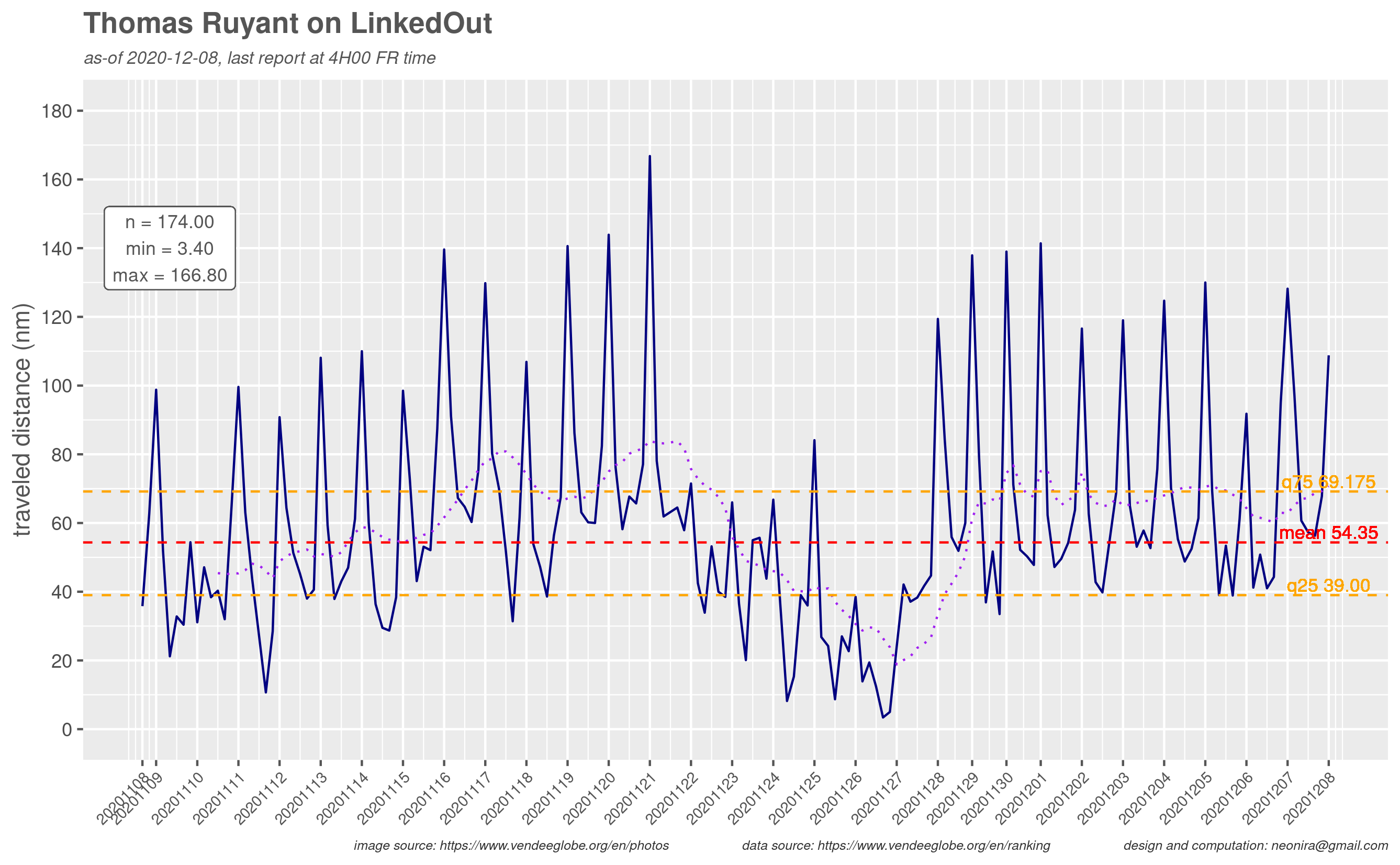
Traveled distance diagram
The traveled distance is interesting as it shows the ability of the skipper to go fast, and its capacity to read meteorological systems. A sharper analysis allows to distinguish when the skipper is attacking or safely calming down the pace.
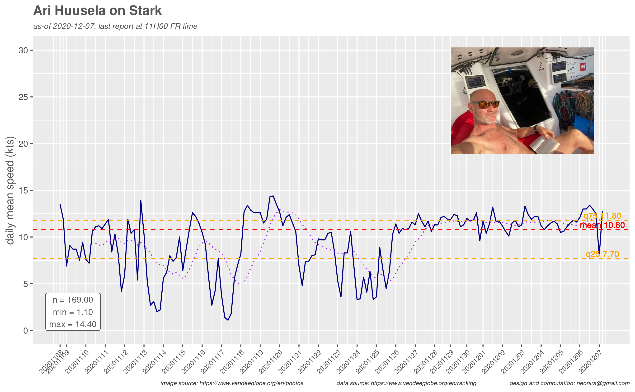
Speed diagram
This results from a montage done with two images, the first one resulting from a ggplot2 save, the second taken from Vendée Globe image library.
For fun, meet the coolest skipper of the 2020 Vendée-Globe.